We're redesigning our City Map Maker
Over the last few weeks, we’ve been working hard to make our city map maker better.
We’ve been thinking really hard and deeply about what we could bring to our editor to increase user experience and help our customers create amazing map art for their walls.
Up until now Craft & Oak’s City map Maker has stayed relatively unchanged and given that we are about to start a new decade in 2021 we figured now’s a great time to bring this up to date.
So we started fresh - and completely stripped back the editor and build it again from scratch.
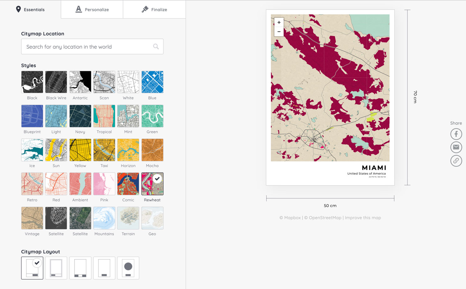
Here is the old one:
There is a number of benefits found in the new city map maker:
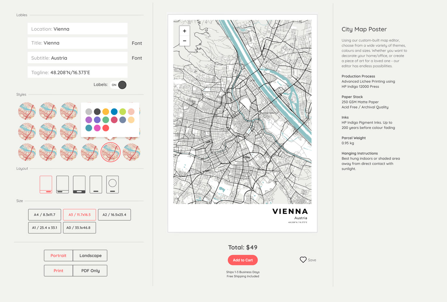
The theme is cleaner and more simple, and we removed the buttons/app-like interface and opened it up completely onto one page so that all the city map-making options are instantly available. This is important as we felt it was an extra hassle for our viewers to have to toggle through the various sections to figure out what options they had what was possible.
We’ve rearranged how our city map styles are displayed. Each style will be that - a style. Which can now be furthered customized by selecting a color.
It’s important to distinguish here that colors and styles are two separate things and should be separated within the editor. This saves space and makes it easier for our customers to create maps. With this new layout, it also makes it possible to add 100’s of new designs and keep them all the same section of the city map maker. Stay tuned regarding some new and interesting styles we’re working on!
We’ve added extra sizes for our map prints. Up until now, we’ve had roughly two sizes, 12x18 and 18x24. Although these dimensions are popular, it just doesn’t make sense anymore to restrict our prints to these sizes and so we’ve opened up to 3 others. This included extra-large sizes like A1 and A0 which look awesome in rooms with high ceilings or large walls.
We’ve included an area where we talk about the city map prints ( left ). This is something I noticed no other website like ours has done. Here we can provide instant and easily accessible information about the papers, inks, and printers we use. We can talk about hanging suggestions and our production process. It’s a great space to add incredibly valuable information about our prints and help customers make the right decision.
The City Map preview area is now larger. This is a pretty obvious improvement but the preview of the map you are making is now…well, larger. Making it easier to see what you’re doing.
This small improvement to the city map maker is part of a larger website revamp we are undergoing. Although we do consider this a new theme for the site, it still holds close to the original style so that it still feels like Craft & Oak - only better. We’ll be rolling out these revamps sitewide over the coming months.
Lots of great things in the works!
Michael
