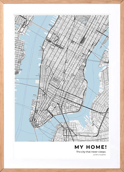
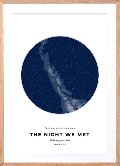
We at Craft & Oak have compiled 5 maps that we find the most interesting that they DON'T teach you in school! Check out the maps below and our take on them.
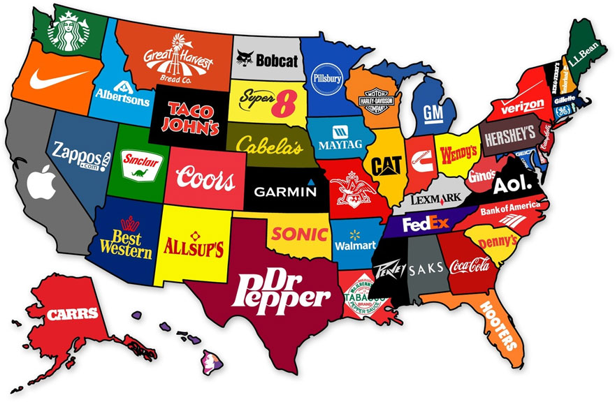
- The Brands that most represent their State in the US. What's interesting to note here are some of these brands I have never heard of (Taco John's, anyone?). It's also super interesting that many of these brands are not tech related. What do you guys think? Do these brands accurately represent YOUR state? I personally love that Maine loves L.L. Bean :)
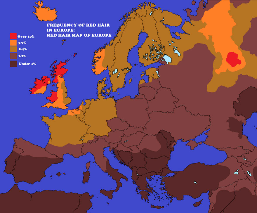
- The Red Hair Map of Europe. Here we see the dispersion of how common red hair is in the European countries. No surprise here that Ireland has the highest concentration of red-heads :)
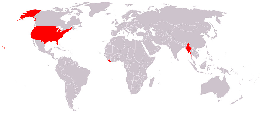
- Map of Countries Officially Not Using the Metric System. Only a few countries don't use the metric system, including us in the States. The biggest reasons the U.S. hasn’t adopted the metric system are simply time and money. We have had discussions in Congress in the past about switching unit systems, but the passage of these bills were heavily voted against due to the fact that big businesses and citizens didn't want to go through the hassle of changing the infrastructure of the country.
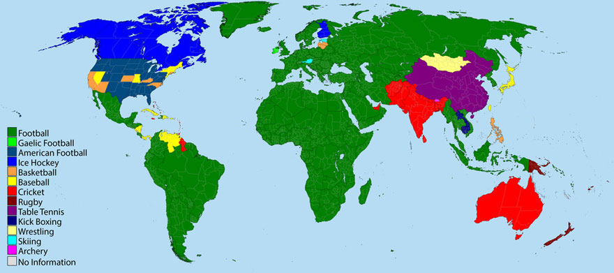
- The most popular sport by country. This is super interesting as most of the world loves soccer (football), but some countries love Cricket, we love American Football, and Canada is basically an Ice Hockey Haven. What's your favorite sport? Hopefully it's represented here :)
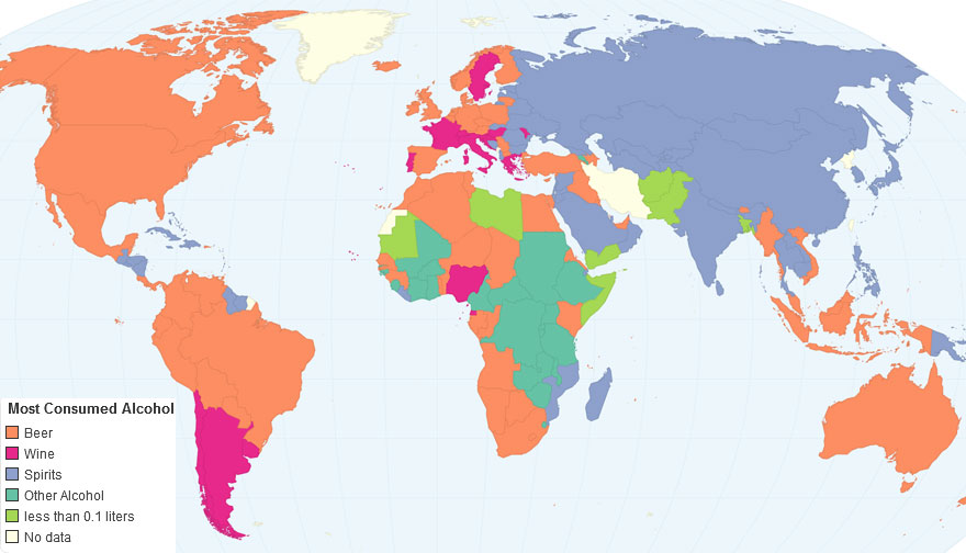
- Lastly, we have the map of countries of the most consumed alcoholic beverages by country. Beer seems to be the drink of choice to imbibe across the world. Most of Russia and Asia seems to love their spirits, and parts of South America and Europe love their wine. Super cool to see!
We hope you enjoyed these awesome maps, please don't forget to check out your own custom map from us and have a great time out there!
Sincerely the Craft & Oak Team.

